MiCRM | Lead Details Page
Redesigning the lead details page - increase user's visibility and productivity
Associate with Cartrack Technology Pte. Ltd

Product Overview
MiCRM is an internal CRM system currently used by the Cartrack sales team. The goal of this redesign was to prepare the platform for go-to-market, with the intention of eventually offering the CRM as a product to external companies. At the same time, the redesign aimed to improve the user experience of the Lead Details Page, which is a critical part of the sales workflow.
At the time of the redesign, many users experienced usability issues on this page. These challenges were particularly noticeable for users working on smaller screens, where the layout made it difficult to quickly view important information. In addition, some users who received assigned tasks were unable to clearly understand their responsibilities or identify their next actions at a glance.
Design Overview
The redesign focused on improving the usability of the Lead Details Page in MiCRM, which serves as the main workspace for sales teams to manage leads, track activities, and take actions. As one of the most frequently used pages in the system, it is critical that users can quickly understand key information and perform their tasks efficiently.
The goal of the redesign was to enhance information clarity and usability so users can easily view lead details, activities, and assigned tasks at a glance. The design also aimed to improve the experience for users working on smaller screens and to better support different sales roles and workflows, while preparing the product to be scalable for future external use.
Initial Research
What is Lead Details Page?
I started by asking a basic question: What is a Lead Details Page? To understand it better, apart from my casual google research, I also did user interviews with 5 different internal sales users (RMs, telesales, team leads, and sales admins) on how they actually use the CRM in their daily workflow and why it is considered the heart of a CRM system. From this, I identified several key points on what lead details page for them

Additionally, I realized that people have different preferences regarding the information they want to see first on the Lead Details Page. Even within the same role, individuals may prioritize different data depending on their workflow or focus at that moment. At the same time, in some teams managers prefer to define what information their team members should see first, in order to standardize processes or guide how leads are handled. This means that not everyone has full control over customizing their view, as certain structures or priorities may be set at the team level.
How other big CRM do it?
In addition to speaking directly with users to understand their workflow and how they use the Lead Details Page, I also conducted secondary research by exploring various CRM platforms that offer free access or trial versions. This allowed me to observe how established CRM systems structure their lead information and workflows. (You can view some of my observations in my blog.)
Through this research and discussions in user forums, one insight became clear: there is no single “right” way to structure a CRM. Even well-established and highly systemized platforms such as HubSpot CRM and Zoho CRM sometimes create confusion for users.
For example, many CRMs separate information across different objects, such as leads, deals, and companies, which means related information may appear in different places. For some users, this structure can feel unintuitive and fragmented, especially when they expect everything related to a lead to exist in a single view.
However, this design choice often serves a system-level purpose rather than a usability preference. Some organizations intentionally separate deal information from lead or company data to manage permissions, ownership, and workflow responsibilities more effectively across teams.
This reinforced an important insight: CRM structures are often shaped by organizational processes, governance, and data management needs, not just individual user preferences. As a result, what may feel confusing for some users can actually support operational control and scalability for the organization.
Identify the gab in the original page
The original lead detail page is functional. Most of the stuffs that they required are there. However, there are some painpoints that I observe and I validate based on the conversation with them. And this is the conlusion
-
Left panel > detail sections are collapsed by default, making it hard for users to find key information at one go
-
To-do task can be quite thick, reduce scrollable area of past activity.
-
UI for the past activity section lacks sufficient spacing, making it difficult to visually separate individual activity cards. This can lead to users mistakenly associating details with the wrong activity.
-
Activity task display too limited information. User has to click and open it to view the notes

The Revamp

Lead Information panel: Less Clicking, Less Scrolling
-
Auto-expanded contents
Critical information is no longer hidden behind its section header - information is now fully displayed by default so users can view important context immediately without additional clicks -
Centralised lead information
Additional lead fields (e.g. 'Needs Analysis' and 'Value Proposition') are moved to the lead information panel for easier reference -
Icons for quick navigation
Hover over an icon to preview the content, or click to jump directly to that section without scrolling
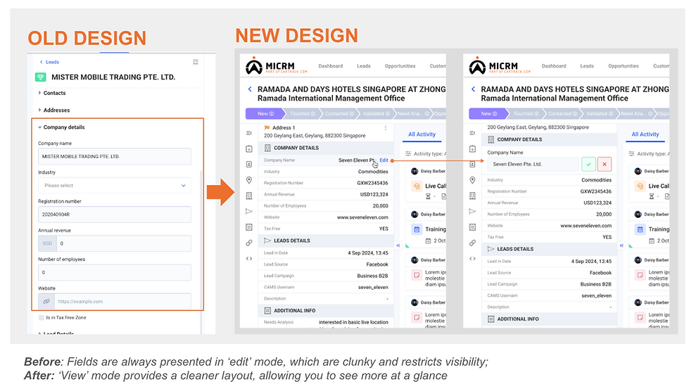
Lead Information panel: Improving Clarity and Efficiency
-
Optimised for small screens
A more compact layout allows users to view more information at once, even on smaller screens!
-
Prevent accidental edits
Information is initially displayed in view mode, transforming to edit mode only when the user hovers over and clicks the 'edit' button
-
Full information for viewers
Users without edit access can now see information in full without being restricted to the more compact view in edit mode

Activity List: More Space to View What Matters
-
Collapsible page header
As you scroll, the page header (with the lead’s name, pipeline, and action buttons) collapses into a streamlined version, keeping important info at your fingertips while saving space -
Collapsible information panel
The lead information panel on the left can be collapsed to give you more room to view your lead’s activity history, especially when working on smaller screens or windows

Task List: Enhanced Visibility & Action
-
Task list in focus
Your task list now pops up in a convenient modal with a bold black top header, making it impossible to miss and easy to stay on track
-
Clearer task indicators
Overdue tasks now stand out with a red background and assignee names are clearly displayed, so you’ll never miss a follow-up again
-
Pending meetings in task list
Upcoming meetings are now included in the task list, ensuring they never get buried in the activity list!
-
Action-oriented buttons
We’ve added action-oriented buttons to make tasks even easier to complete: use “Call Now” for quick calls and “Complete” for ticking off to-dos. No more guessing what’s next!
-
Collapsible list
Now, you can hide your task list when you don’t need it, while still seeing how many tasks are open. Stay organized without the clutter!

Activity Card: Better Organisation & Controls
-
Grouped activity box
Timestamp and content are combined in a single box for clarity and to prevent misattribution -
Expand activity notes in-line
Quickly expand or collapse long notes and attachments, allowing access to full content without opening individual activity windows -
Display information that matters most
Activity ID has been relocated from the activity card into the details widget, still accessible when needed, but no longer adding visual clutter to the main workflow. -
Compact audio player & more audio control
A smaller and more subtle audio player appears only when audio exists, helping reduce distraction.
Continue listening while scrolling, with a mini player pinned at the bottom-left for quick play, pause, and speed adjustments anytime.

Lead Lifecycle: Clearer Visual Indicators
-
Clearer colour indicators
We’ve enhanced status visibility, making it easy to identify a lead’s status at a glance. For Lost and Invalid leads, the header now displays who triggered this status, giving users faster clarity on accountability and changes -
Lifecycle events in activity list
Lifecycle events (lost, invalid, recycle) now appear directly in the activity list with color distinction, preventing activities that happened before vs. after recycling from blending together so you can quickly understand ownership history and follow-up context

Lead Information Order : Re-order Sections to Fit Your Needs
-
Branch-level custom order assignment
Admins can define how the lead information sections are ordered for each user profile -
Personal customisations
With permissions granted, you can reorder the sections in their lead information panel based on their individual preferences. This lets you prioritize the details that matter most

After the Beta Evaluation
After the beta launch of the page, we observed user behavior and received several feedback points. One immediate improvement we implemented was related to the visibility of the task and activity list, which was especially noticeable for users working on larger screens.
To address this, we made the task panel more flexible by adjusting how it appears based on the user’s browser width. The system now determines whether the task view should appear as a right-side panel or as a floating window by default. This allows users with larger screens to have a fuller view of their activities without creating an overly long activity window. As a result, users can more easily scan the activity status, action buttons on the right, and the related information on the left side of each activity card.

Takeaway
Through this project, I learned that designing CRM systems requires balancing different user needs, workflows, and organizational constraints. While many users perform similar tasks, their priorities for information can vary greatly depending on their role. For example, telesales users often prioritize tasks and activities that require immediate action, while managers may focus more on pipeline status or lead progress. This reinforced the importance of designing interfaces that clearly prioritize information while still supporting flexibility for different working styles.
Another key learning is that valuable insights often emerge after launch.
During the beta phase, user feedback revealed areas that were not fully visible during earlier testing, such as the visibility of activity lists on larger screens and how users scan tasks and actions. This led to improvements like making the task panel more flexible based on browser width to better support different screen sizes and working environments.
Moving forward, there are still opportunities to further enhance the experience. This includes improving task visibility and activity management, refining how information is structured on the Lead Details Page, and continuing to evaluate how the layout adapts to different user roles and screen environments. Currently customisations only available for the side panel. However, ideally organisations/branch should be able to decide what information they would like to view in their lead details page (the header, right panel etc.) Continuous iteration and user feedback will remain important to ensure the system evolves alongside the needs of the sales teams.


